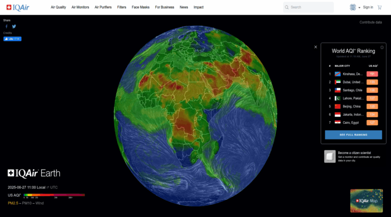
Ever wondered how the global air pollution flow would look like if we were to see it in real-time? This is where AirVisual Earth comes into play. The founder Yann Boquillod created a 3D visualisation based on satellite date originating from mover 8000 monitoring stations to display global air pollution in real-time. One of the prime culprits of pollution is particulate matter (PM in short). Typically PM is followed by a set of digits denoting the size of matter in microns. Essentially, 1 micron is a 1000th of a mm. By comparison, bacteria ranges between 0.3 and 80 microns in size! Now refined particles of the order of PM2.5 are particularly harmful to human beings. because they are so small that they can easily penetrate into the human lungs. Additionally, they are so small that they can easily be dispersed through wind. The following 3D map shows how PM2.5 flows in real-time across the globe. You can tilt (by holding down the mouse button or dragging on the screen) to tilt the globe and you can also use your mouse scroll wheel to zoom in.